UI/UX design for qutebrowser, a web browser for power users
- Suggestions for design improvements for the user interface (while keeping its minimalism)
- Optionally, suggestions for possible UX improvements
- Optionally, changes to default settings and/or CSS-like parts of the code based on the new design
Florian Bruhin (maintainer) mail@qutebrowser.org
https://www.qutebrowser.org/
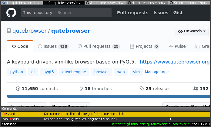
The qutebrowser project is a web browser for power users, focused on keyboard usage. Its inspired by the vim editor and similar to projects like Tridactyl, Vimperator or Vimium.
Due to its userbase, its UI design is rather minimalistic. However, some users feel like the default theme looks dated or ugly. I’d like to find out what can be done about that, while keeping the minimalism of its user interface.
Additionally, it might be interesting to explore what can be done UX-wise to make it more accessible to new users, while still keeping the focus on power users.
It’d be great if you used similar projects before (and/or the vim editor, and/or commandline-tools in general), so that you can get a feeling for its userbase.
Please don’t use generic copy-pasted responses, they can get you banned. See our guidelines.